Many brands with a long history have the same problem: they have a rich story, but most people never see it.
Schweppes' latest redesign by JKR is interesting because it brings that history into the brand's everyday visual identity. Instead of creating something completely new, the team looked at what already made Schweppes unique and found better ways to highlight it.
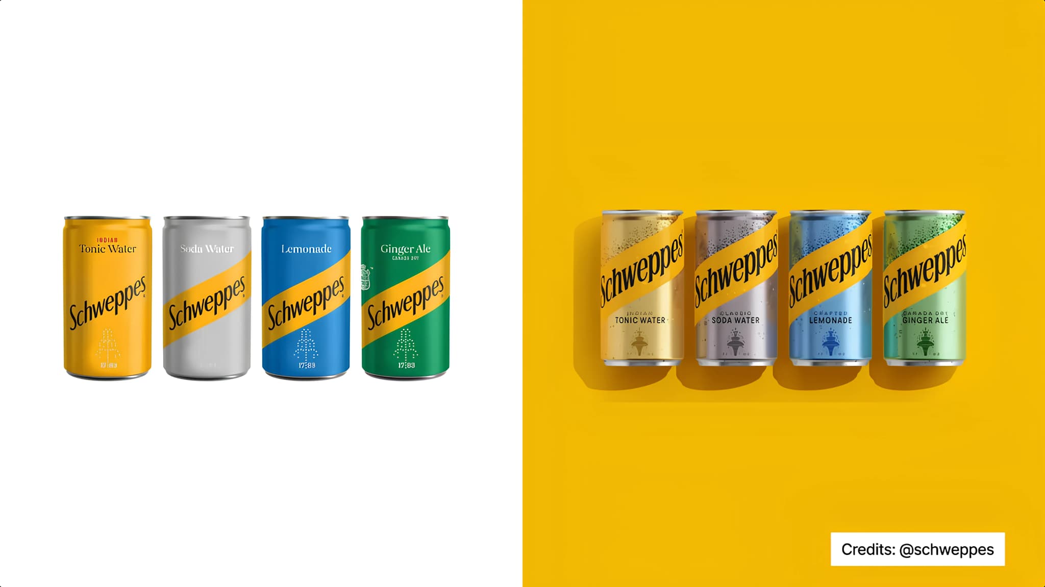
The updated wordmark takes inspiration from the brand's past, while the fountain emblem has been refined using references from Schweppes' history. The iconic yellow has also been given a bigger role, making the brand easier to recognise from a distance and helping it stand out on shelves.
The redesign goes beyond the logo too. New patterns, monograms and graphic elements create a stronger visual system that can be used across packaging, advertising, social media and other touchpoints. Together, these elements make the brand feel more distinctive and consistent.
What stands out most is how all of these elements work together. Rather than simply talking about its heritage, Schweppes has built it into the design itself.
Every interaction with the brand now reinforces the same story, making its history easier to notice and remember.


