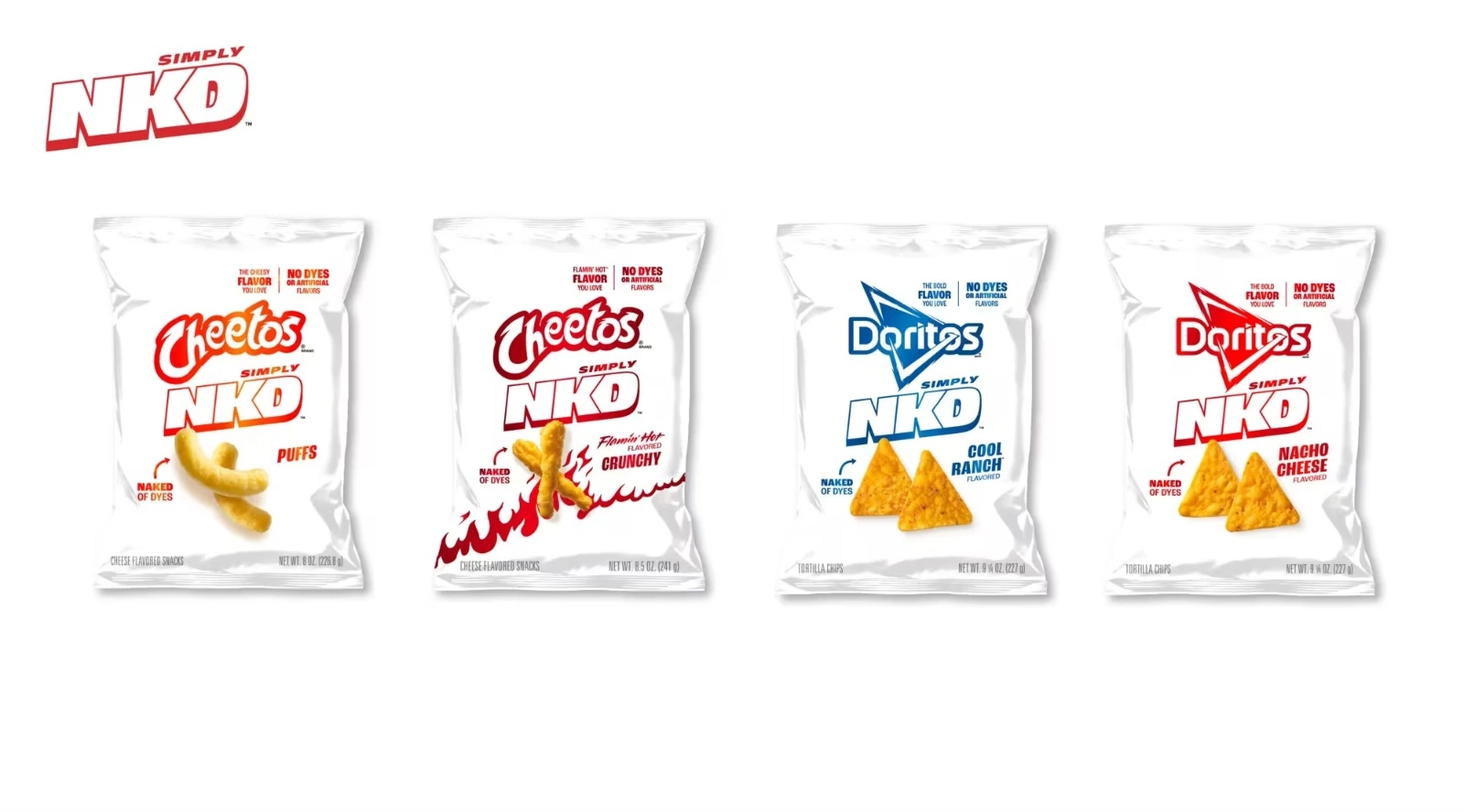
PepsiCo just launched a new line of Doritos and Cheetos called Simply NKD, chips made without artificial dyes or flavours.
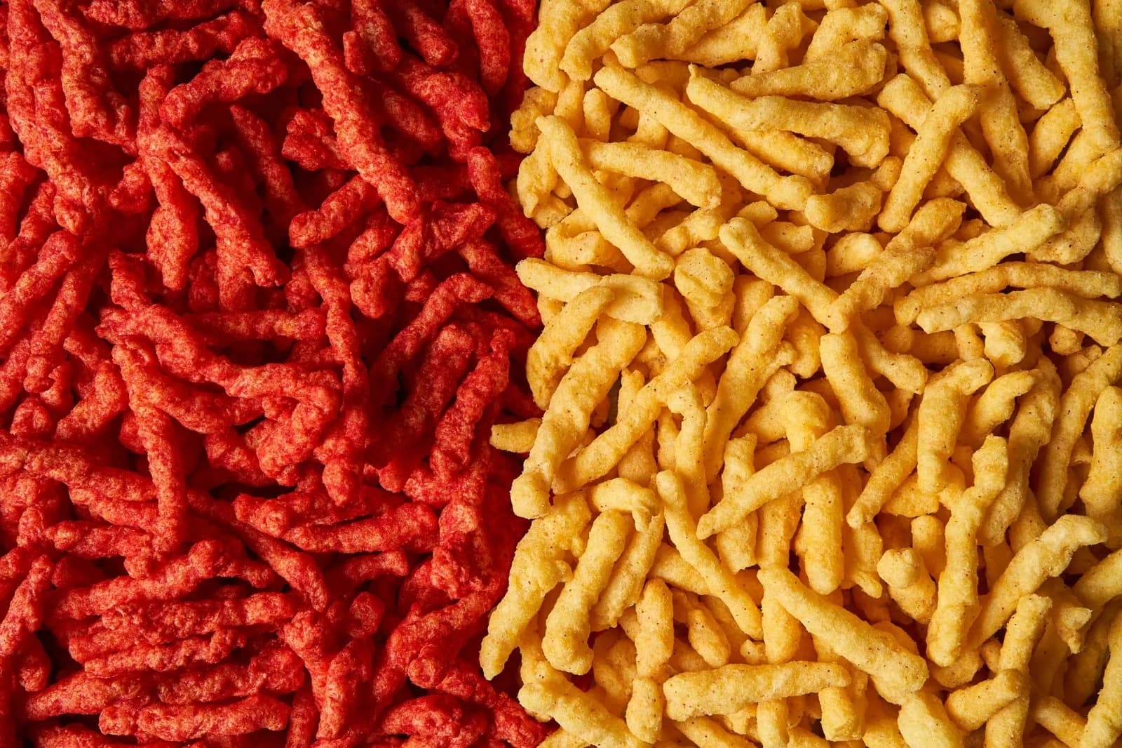
The biggest change is the iconic neon-orange coating is gone. And that shift didn’t just change the chips but the packaging too.
The PepsiCo Design team translated the new “cleaner” recipe into white matte bags, minimal metallic graphics and a look that feels lighter, calmer and more natural.
This is a great example of how design communicates what words alone never can.
What This Change Really Does
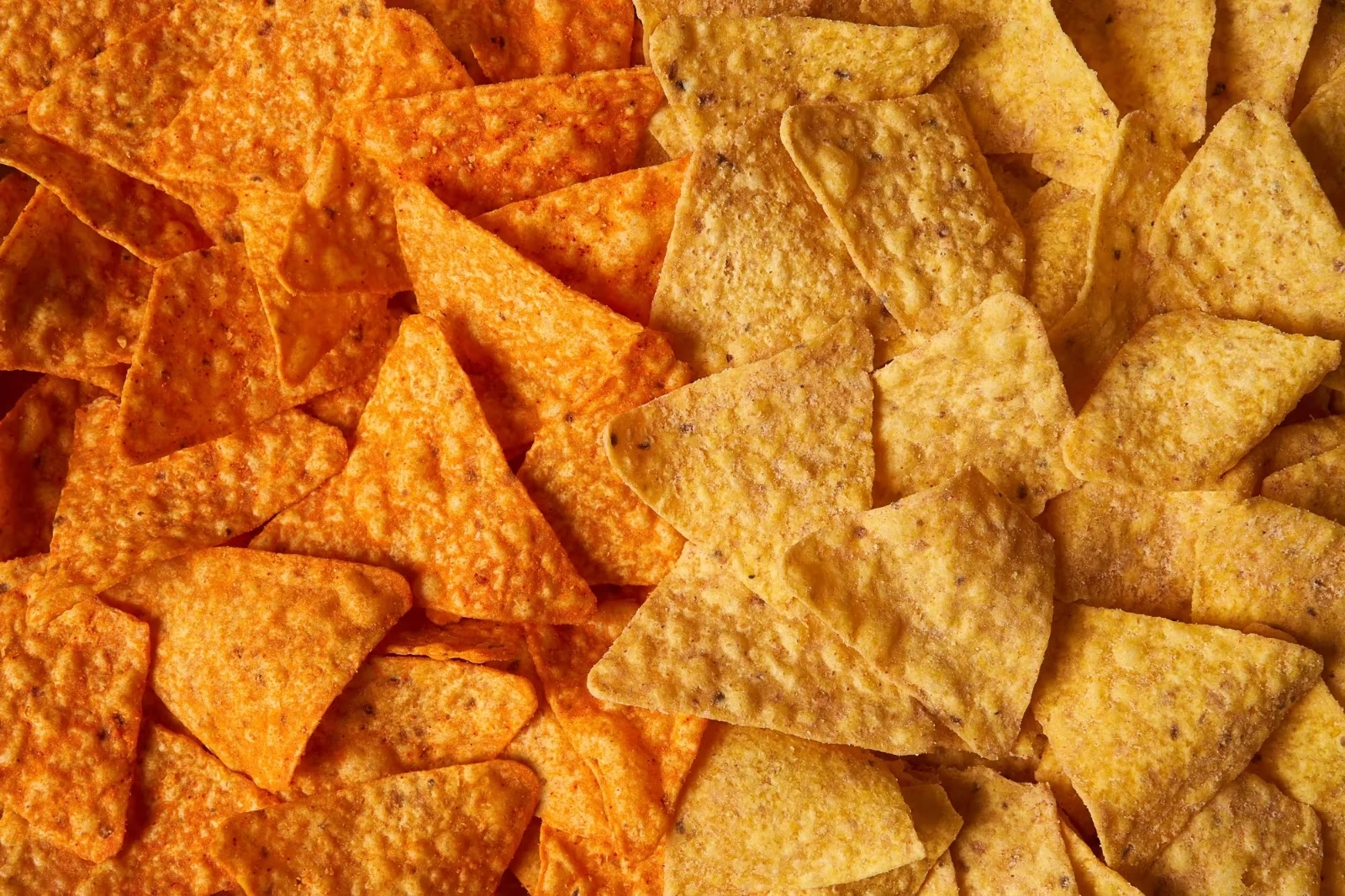
Most people know Doritos and Cheetos for two things, bold flavour and bold colour.
That orange dust is almost part of pop culture. So removing artificial dyes changes the whole visual identity of the product. By stripping away the colour in the chips, PepsiCo also had to strip away the colour in the packaging.
The matte white bags signal “cleaner ingredients” before someone even reads the label. The minimal metallic graphics hint at the brand’s personality without overwhelming the new simplicity.
It proves how powerful packaging can be in shaping expectations. Even if consumers haven’t tasted the chips yet, the design sets up a story about transparency, freshness, and trust.