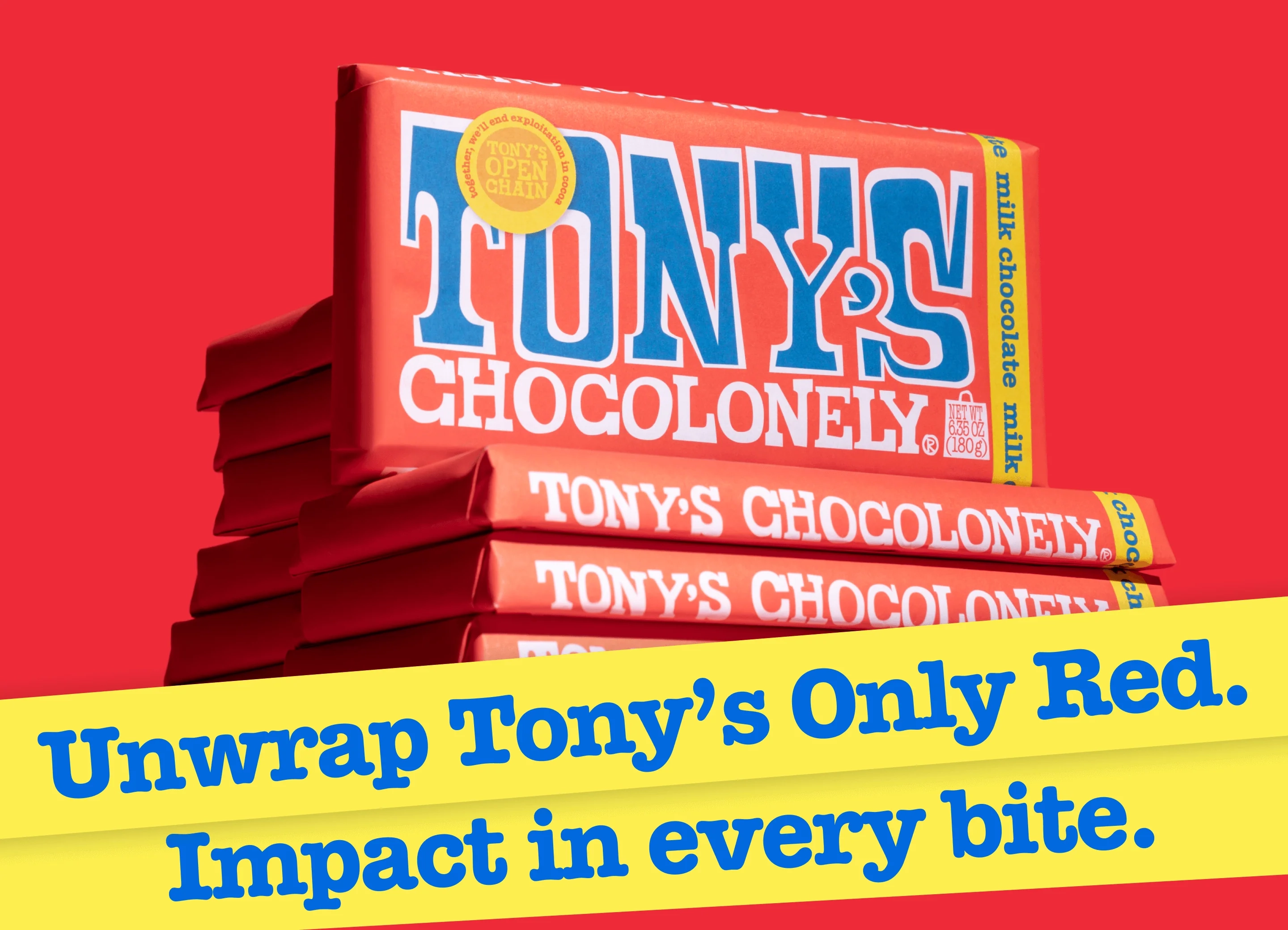
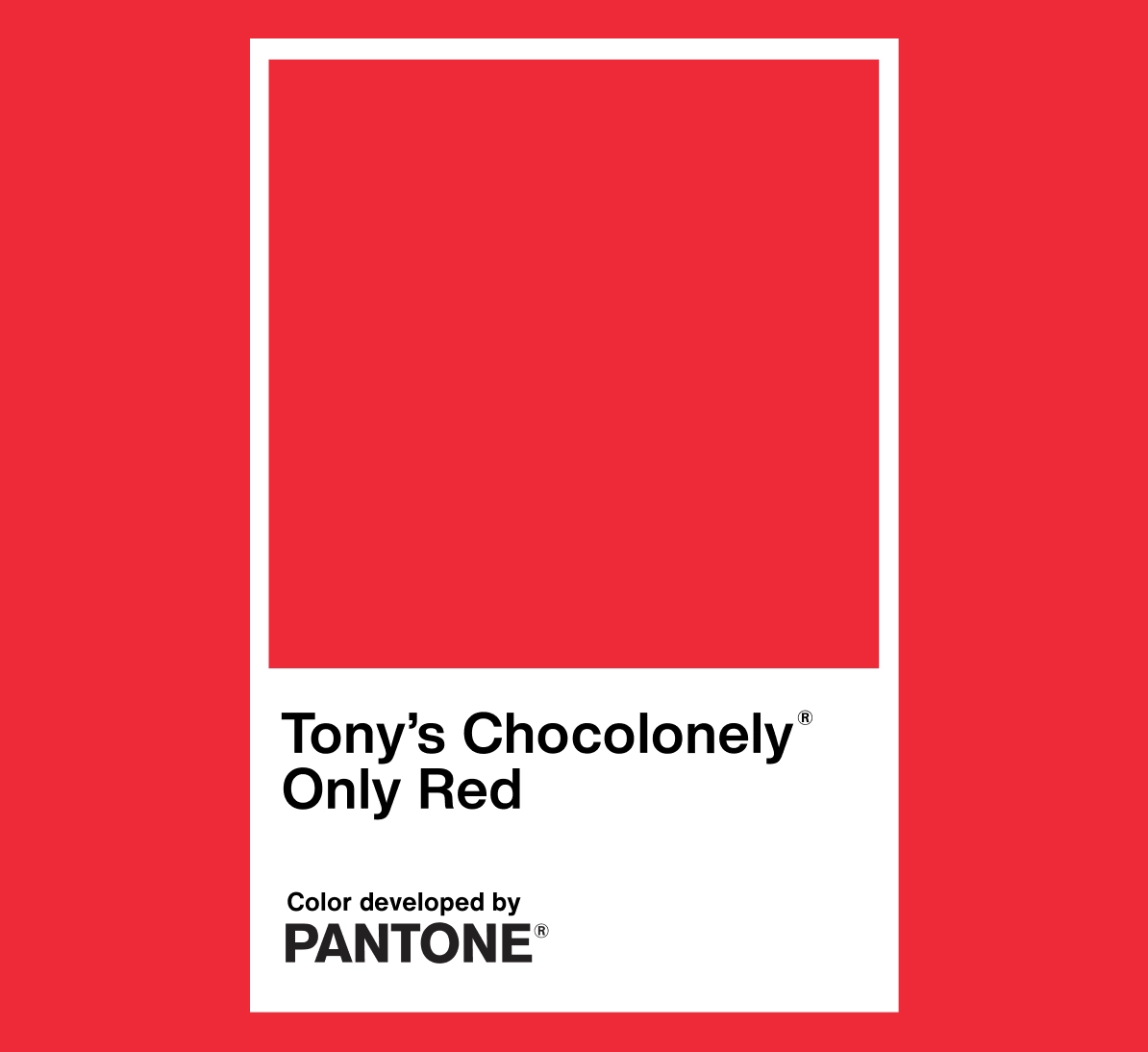
Tony’s Chocolonely recently hit a major milestone when Pantone officially recognised the brand’s signature wrapper colour as its own shade, Tony’s Only Red.
It’s a big deal in the design and branding world, but the challenge was how do you turn a colour code into something regular people care about?
To solve this, the creative agency Here Be Dragons created something people could actually step into and experience, a fun, bold and very Tony’s-style pop-up called The Tony’s Only Red Room.

What They Did And Why It Works
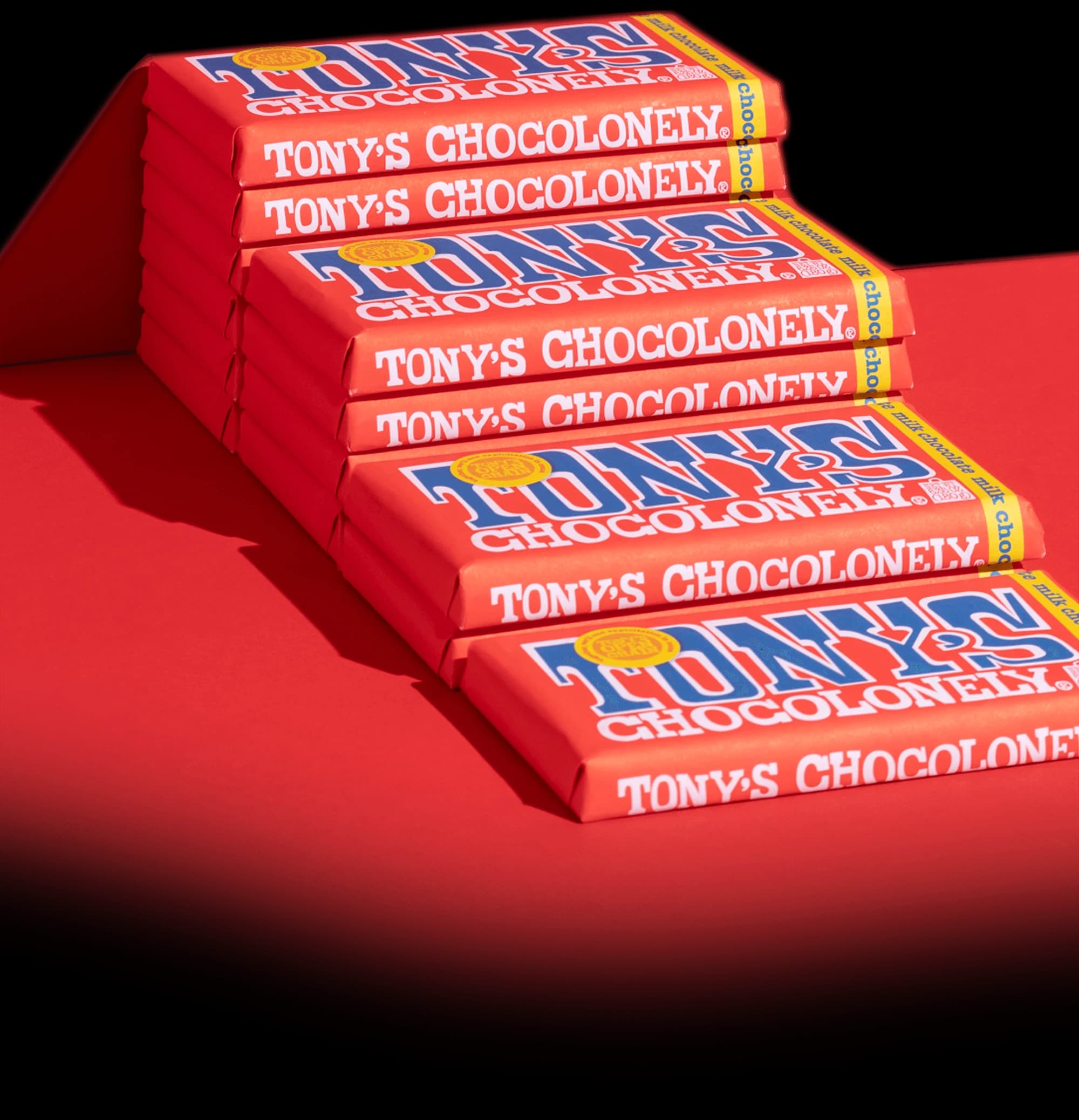
Tony’s is a brand that’s all about the feel of the chocolate bar, loud colours and playful attitude. The team leaned into this by turning the Pantone shade into a physical space.
They chose Soho in London, right in the Red Light District and transformed a booth into a fully red, fully immersive chocolate experience.
Inside the booth, everything was covered in rich red textures, all inspired by Amsterdam, where Tony’s began. When someone walked up, a concierge pulled open a curtain and let them step inside for five quiet minutes to enjoy a full bar of Tony’s chocolate.
By doing this, the team made the colour “Tony’s Only Red” something people could actually see, touch,and connect with. Instead of talking about the colour, they let people experience it in the most Tony’s way possible.